This tutorial will show you how to turn a simple React-Select dropdown into a fully-fledged autocomplete search box which searches by remote data and caches results. I will add custom settings and styles to the React-Select component itself, implement debouncing with lodash.debounce and enable search result cache with React-Query.
For demo purposes, I will use a dataset with countries and their populations.
“If I cease searching, then, woe is me, I am lost. That is how I look at it - keep going, keep going come what may.” - Vincent van Gogh, The Letters of Vincent van Gogh
Source code and demo
The code for all examples demonstrated in this tutorial is located on Github and hosted on Vercel. Clone the code locally to follow the tutorial along.
The demo project has been built with Create React App and TypeScript.
All of this is actual for react-select 5.4.x. Please let me know if the API has changed and this tutorial needs an update.
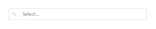
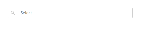
1. Dropdown without customizations
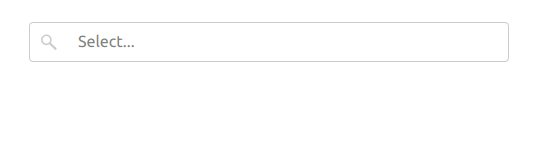
I will start from the minimal configuration:
The initial search bar is clearable, so you can clear the value by using the clear icon. It's autocompleting, so you can start typing the option name which you're looking for to filter out the options.
import Select from 'react-select'

<Select
  options={countriesLocal}
  isClearable={true}
  isSearchable={true}
/>
It uses the local static option array:
interface ICountryOption {
  label: string
  value: string
  population: number
}

const countriesLocal: ICountryOption[] = [
  { label: 'China', value: 'china', population: 1402000 },
  { label: 'India', value: 'india', population: 1380000 },
  { label: 'USA', value: 'usa', population: 330000 },
]
Here the label and value properties are required by the React-Select component and the population option is my addition which will come in handy later on. In fact, you may add any data to the options.
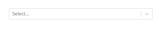
2. Remove the dropdown indicator separator
It's possible to remove some parts of the Select component using the components property of the React-Select component.
Here I will remove the separator bar from the dropdown indicator.
<Select
  // …
  components={{
    IndicatorSeparator: () => null,
  }}
/>

3. Replace the dropdown indicator icon
The components property can also be used to replace the dropdown icon.
Let's replace the dropdown icon with an SVG search icon which I've just created in Figma.
import Select, { components } from 'react-select'

<Select
  // …
  components={{
    // …
    DropdownIndicator,
  }}
/>

const DropdownIndicator = (props: any) => {
  return (
    components.DropdownIndicator && (
      <components.DropdownIndicator {...props}>
        <SearchIcon />
      </components.DropdownIndicator>
    )
  )
}

const SearchIcon = () => (
  <svg
    width="22"
    height="22"
    viewBox="0 0 100 100"
    fill="none"
    xmlns="http://www.w3.org/2000/svg"
  >
    <circle cx="38" cy="40" r="20.5" stroke="currentColor" strokeWidth="7" />
    <path
      d="M76.0872 84.4699C78.056 86.4061 81.2217 86.3797 83.158 84.4109C85.0943 82.442 85.0679 79.2763 83.099 77.34L76.0872 84.4699ZM50.4199 59.2273L76.0872 84.4699L83.099 77.34L57.4317 52.0974L50.4199 59.2273Z"
      fill="currentColor"
    />
  </svg>
)
I use any as a prop type to simplify things. Feel free to specify a proper type for it if you wish.
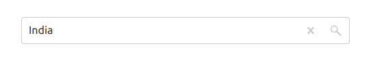
4. Move the dropdown icon to the left
I could use isRtl={true} to revert option and indicator positions but it would also align option text to the right, which is not ideal. Instead, I will override styles of the Select component and use a flexbox trick.
The styles for the React-Select component are written with the Emotion library, so I will stick to the same notation.
<Select
  //…
  styles={customStyles}
/>

const customStyles = {
  control: (base: any) => ({
    ...base,
    flexDirection: 'row-reverse',
  }),
}
5. Move the clear icon to the right
At this stage, the only thing that makes the search box unusual is the clear icon which should be on the right-hand side. Let's fix it by adding some more styles.
const customStyles = {
  // …
  clearIndicator: (base: any) => ({
    ...base,
    position: 'absolute',
    right: 0,
  }),
}
Looks better now, right?
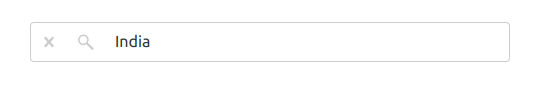
6. Prevent clearing value on blur
You might not have noticed it but there is one issue that specifically bothers me.
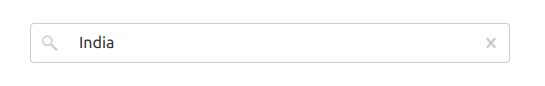
When you enter a few letters of a country name, for example “ind” for “India” and move focus to another page element, the search box is automatically cleared, so when you come back to it you have to start entering the country name from scratch.
To retain the already entered value, we need to override the onInputChange event handler this way:
import Select, { components, InputActionMeta } from 'react-select'

const [inputText, setInputText] = useState<string>('')

const handleInputChange = (inputText: string, meta: InputActionMeta) => {
  if (meta.action !== 'input-blur' && meta.action !== 'menu-close') {
    setInputText(inputText)
  }
}

<Select
  // …
  inputValue={inputText}
  onInputChange={handleInputChange}
/>
As you can see, I use an additional state variable to only change the input text when a user enters something, ignoring Blur and Close events.
7. Display custom data in options
It's time to use the population field, which I added to the options in the beginning. I want to display the population next to the country name in options.
<Select
  // …
  styles={customStyles}
  formatOptionLabel={formatOptionLabel}
/>

const customStyles = {
  // …
  valueContainer: (base: any) => ({
    ...base,
    paddingRight: '2.3rem',
  }),
}

const formatOptionLabel = (option: ICountryOption) => {
  return (
    <div
      style={{
        display: 'flex',
        flexDirection: 'row',
        justifyContent: 'space-between',
      }}
    >
      <div
        style={{
          flexGrow: '1',
          textOverflow: 'ellipsis',
          whiteSpace: 'nowrap',
          overflow: 'hidden',
        }}
      >
        {option.label}
      </div>
      <div style={{ textAlign: 'right', color: 'green' }}>
        {option.population / 1000}m
      </div>
    </div>
  )
}
You see I've added the population highlighted in green by using custom styles for valueContainer and custom formatter for options.
8. Search by remote data
For test purposes, I've created a simple web service which allows finding a country by its name or country code.
https://countries-api-for-blog.vercel.app/api/countries
https://countries-api-for-blog.vercel.app/api/countries/norw
Please use this service for test purposes only because I cannot guarantee that it will keep working in the future.
Now let me marry the country search service with the search box.
First, let's add the performSearchRequest() function which is aimed to send HTTP requests to our country search service. You may put it anywhere in the file.
const performSearchRequest = async (searchText: string) => {
  const response = await fetch(
    `https://countries-api-for-blog.vercel.app/api/countries${
      searchText ? '/' + searchText : ''
    }`
  )
  return await response.json()
}
I need state variables for resulting country options and a loading indicator.
const [countries, setCountries] = useState<ICountryOption[]>([])
const [isLoading, setIsLoading] = useState<boolean>(false)
Next, I will add a wrapper around the performSearchRequest() function which will be handling errors and some edge cases.
const handleSearch = async (searchQuery: string) => {
  if (searchQuery.trim().length === 0) {
    setCountries([])
    return
  }

  setIsLoading(true)

  let countries = []
  try {
    countries = await performSearchRequest(searchQuery)
  } catch (e) {
    console.error(e)
  } finally {
    setCountries(countries)
    setIsLoading(false)
  }
}
And one last touch before I join it all together… It's a custom no-results message because I don't like the default one.
const noOptionsMessage = (obj: { inputValue: string }) => {
  if (obj.inputValue.trim().length === 0) {
    return null
  }
  return 'No matching countries'
}
Alright, now I'm ready to edit the handleInputChange handler to run the search right from it.
const handleInputChange = (inputText: string, meta: InputActionMeta) => {
  if (meta.action !== 'input-blur' && meta.action !== 'menu-close') {
    // …
    handleSearch(inputText)
  }
}
And the resulting Select component will get the following additional properties:
<Select
  // …
  options={countries}
  onInputChange={handleInputChange}
  isLoading={isLoading}
  filterOption={null}
  noOptionsMessage={noOptionsMessage}
 />
I'm almost done with the search box. Next two modifications are optional but recommended because they will save bandwidth and improve search performance.
9. Debouncing
Currently the search box sends requests to the server with every input value change, which is not optimal in terms of performance. To limit the number of requests, I will use a debouncing technique. With debouncing, the app will be sending search requests no more often than in every 300 milliseconds.
A nice package called lodash.debounce will help me with it.
In case you stole a programmer's laptop and have no idea hot to install js dependencies, I will put it here:
yarn add lodash.debounce
yarn add -D @types/lodash.debounce
Let me rework the code a little bit to utilise debouncing.
import debounce from 'lodash.debounce'
import { useRef, useState } from 'react'

const handleSearchDebounced = useRef(
  debounce((searchText) => handleSearch(searchText), 300)
).current

const handleInputChange = (inputText: string, meta: InputActionMeta) => {
  if (meta.action !== 'input-blur' && meta.action !== 'menu-close') {
    setInputText(inputText)
    handleSearchDebounced(inputText)
  }
}
As you can see, I've wrapped the handleSearch() call into the debounced handleSearchDebounced() handler.

10. Caching
Finally, it'd be good to cache the API queries to respond quicker in case if the same search query entered again. I will be using React Query for that but you may consider other options too, such as SWR or apollo-client depending on your API format.
yarn add react-query
To use React-Query anywhere in the app, I first need to wrap my main component into QueryClientProvider.
import { QueryClient, QueryClientProvider } from '@tanstack/react-query'

const queryClient = new QueryClient()

function App() {
  return (
    <QueryClientProvider client={queryClient}>
      {/* Your main app code */}
    </QueryClientProvider>
  )
}
Then in my working component file, I will import the useQuery hook from the React-Query package.
import { useQuery } from '@tanstack/react-query'
The component code will get some updates too:
const [inputText, setInputText] = useState<string>('')
const [searchText, setSearchText] = useState<string>('')

const { isLoading, error, data } = useQuery(
  searchText ? ['countryData', searchText] : ['countryData'],
  async () => await performSearchRequest(searchText),
  {
    enabled: !!searchText,
  }
)

const handleSearchDebounced = useRef(
  debounce((searchText) => setSearchText(searchText), 300)
).current

const handleInputChange = (inputText: string, meta: InputActionMeta) => {
  if (meta.action !== 'input-blur' && meta.action !== 'menu-close') {
    setInputText(inputText)
    handleSearchDebounced(inputText)
  }
}
Here, the new state variable searchText is used to trigger search requests while inputText ensures that the component responds to the user input immediately.

That's it. My search component is complete. Check out the final state here.
Conclusion
To be honest, it has taken quite some time to write this tutorial. Some of the solutions have been discovered the hard way by debugging real client projects and going through StackOverflow and Github issues. So I hope it can save you time.