I've been following Solid.js for quite a while and even recorded a video series about migrating to Solid.js,
so when I found the solid-element project, I got up to speed with it organically.
In this tutorial, we will build a resizable-button web component with support for light/dark theme switching.
Let's start from the basics.
About Solid.js and solid-element
To put it simply, Solid.js is a React-like framework with improvements, like better reactivity. The solid-element project is an extension for Solid.js that lets you build Web Components using JSX and Solid.js primitives.
The Web Components built with solid-element have no external dependencies, meaning you can use them in static HTML as any other HTML element, like Input or Button. It doesn't matter what framework you're building with (React, Vue, Svelte), the web components are going to work there.
Do you see why many companies bet on Web Components? Right, you build once and for all frameworks.
About light-dark()
The light-dark() CSS function is a modern vanilla CSS light/dark color switching mechanism.
Creating a Web Component
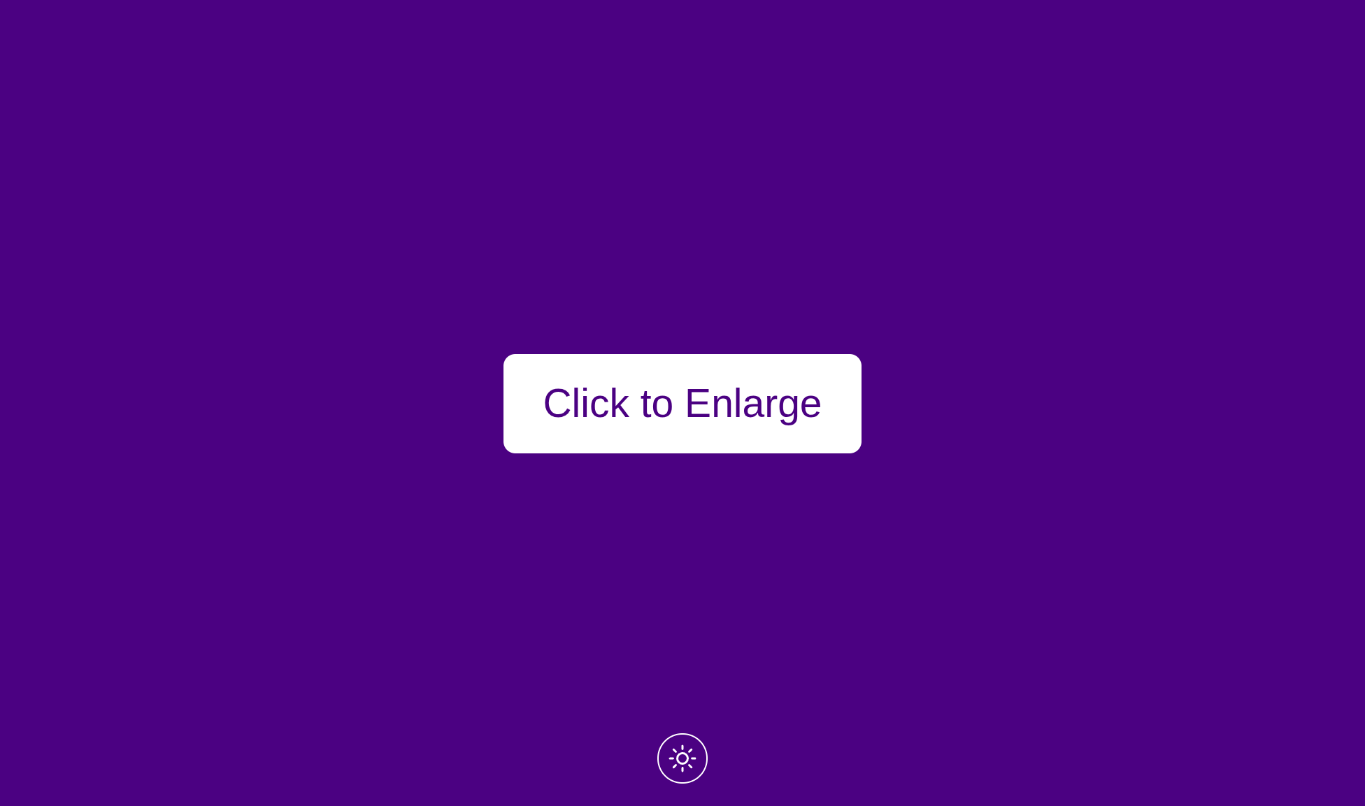
Let's define a custom element called resizable-button with its default size.
// resizable-button.tsx
import { customElement } from 'solid-element'
import { createSignal } from 'solid-js'

export interface ResizableButtonProps {
  defaultSize?: number
}

// ...

customElement(
  'resizable-button',
  { defaultSize: 10 },
  (props: ResizableButtonProps) => {
    const { defaultSize } = props

    const [buttonSize, setButtonSize] = createSignal(defaultSize!)

    const handleButtonClick = async () => {
      setButtonSize((currentSize) => ++currentSize)
    }

    return (
      <div>
        <style>{styles(buttonSize())}</style>
        <button onClick={handleButtonClick}>Click to Enlarge</button>
      </div>
    )
  }
)
Noticed familiar JSX syntax in the component markup? Anything else similar to React? It's how Solid.js defines state variables like buttonSize. It syntactically resembles useState() in React if you know what I mean.
Here, when user clicks the button, the handleButtonClick handler increments the buttonSize variable.
Styling Shadow DOM
In their turn, styles for the component depend on the buttonSize variable value.
const styles = (size: number) => `
:host button {
  /* ... */
  border-radius: ${size * 0.5}px;
  padding: ${size}px ${size * 1.5}px;
  font-size: ${size * 1.5}px;
  /* ... */
}
`
By default solid-element creates components with Shadow DOM enabled, meaning that the styles are isolated there.
I'll keep it this way, but if you want to disable this default behavior, you can put noShadowDOM() from solid-element to the component function.
As you may see, I'm using :host selector to refer to the host component element resizable-button in the Shadow DOM environment.
Theming with light-dark()
Next thing I'm going to draw your attention to is the light-dark() color switcher.
const styles = (size: number) => `
:host button {
  /* ... */
  background-color: light-dark(indigo, white);
  color: light-dark(white, indigo);
  border: 1px solid light-dark(white, indigo);
  /* ... */
}
`
In the example above, the background-color: light-dark(indigo, white) line reads the following:
"We set the background color of the button to indigo for the light theme and to white for the dark theme."
Finally, you need to add support for the light and dark theme switching to the HTML page.
<!doctype html>
<html lang="en" class="light">
  <head>
    <style>
      :root { color-scheme: light dark; }
      .light { color-scheme: light; }
      .dark { color-scheme: dark; }
    </style>

    <script>
      function toggleTheme() {
        document.documentElement.classList.toggle('light');
        document.documentElement.classList.toggle('dark');
      }
    </script>

    <script type="module" src="/vendor/resizable-button.mjs"></script>
  </head>
  <body>
    <resizable-button />

    <button onClick="toggleTheme()">Toggle Theme</button>
  </body>
</html>
The most important piece here is :root { color-scheme: light dark; } which add support for both color themes (aka schemes).
By toggling light and dark CSS classes for the html element through JavaScript, we change the resizable-button theme here.
I intentionally provided vanilla HTML example to confirm that solid-element components don't require any external dependencies, which allows using them with the framework of our choice.
Check out the project demo and the source on Github.
Potential improvements
While writing the post, I didn't set the goal to make the code perfect, so here are some possible improvements:
- Use CSS variables for base colors instead of
whiteandindigo. - Pass background and foreground colors to the
resizable-buttoncomponent through attributes. - For anything but colors, use color scheme media queries instead of
light-dark().
Finally, you can find a real-life application of the described techniques in my Dictate Button project.